
We Analyzed the New DOGE Medicaid Dataset for HME/DME Providers. Here's What We Found.
Feb 16, 2026

227 Million Rows, but no good way of exploring the data…yet
HHS has been quietly releasing government datasets that were never publicly available before. Most of them are raw data dumps that require serious work to make useful. The latest — and the one getting all the attention after DOGE promoted it as the largest Medicaid dataset in agency history — is a provider spending file built from T-MSIS (the Transformed Medicaid Statistical Information System): 227 million rows of claim-level payment data, one row for every combination of provider, procedure code, and month going back to January 2018. Every Medicaid dollar paid to every provider across all 50 states, DC, and the territories, covering fee-for-service, managed care, and CHIP.
Most of the early analysis has focused on Medicaid fraud detection — flagging billion-dollar billing anomalies and suspicious providers. That's important work, but nobody has looked at what this data says about the durable medical equipment (DME) and home medical equipment (HME) industry specifically. It's sitting as a raw parquet file on the HHS Open Data portal, and it's not the kind of thing you can open in Excel.
We used Claude Code to pull the whole thing apart — a 2.9GB compressed file, roughly 10GB uncompressed. In plain English, we told it what we wanted to understand, and it wrote the scripts to query the data, filter it down to 8 DME categories, enrich it with provider names and locations from the NPI registry, and build an interactive tool so anyone in the industry can explore it. More on that process below. Here's what we found.
Small Providers Are Growing Faster Than the Big Ones
This is the finding we keep coming back to. When we broke providers into tiers by annual Medicaid billing volume and compared 2022 to 2023 growth rates, the pattern was consistent across every category:
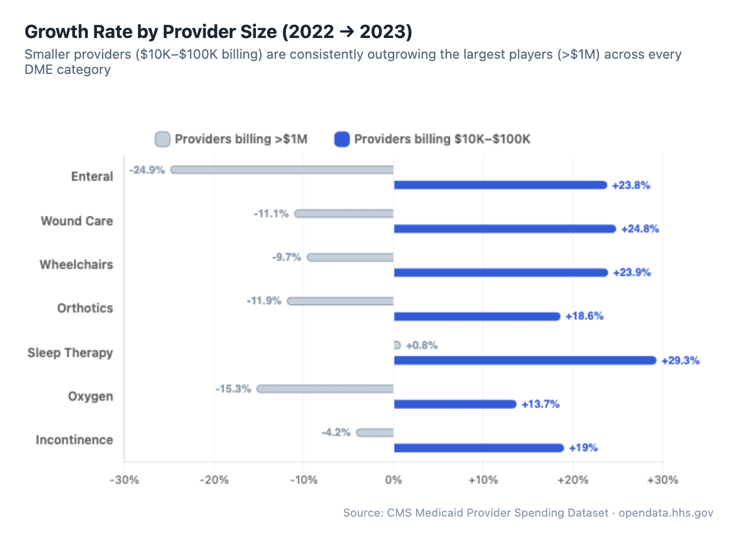
It's not even close. In sleep therapy, providers billing $10K–$100K grew 29.3% while the >$1M providers grew just 0.8%. In wound care and wheelchairs, the largest providers actually shrank while smaller ones grew 20%+. The pattern holds across all 8 categories we analyzed — enteral, orthotics, oxygen, incontinence, all of them.
The largest providers are flat or shrinking. Mid-size and smaller providers are growing 5–30x faster. And this isn't a one-year anomaly: when we looked at market concentration over time, the top 50 providers' share of total spending has been essentially flat since 2019. In sleep therapy, the top 50 hold about 31% of the market. In wheelchairs, about 55%. Those numbers haven't budged.
The industry isn't consolidating. The long tail is getting longer.
But the opportunity isn't evenly distributed. When we looked at how spending breaks down by provider size across all 8 categories, the differences are dramatic. In sleep therapy, providers billing under $1M account for 68% of total Medicaid spending — the category is wide open. Enteral and incontinence are the opposite: the largest providers control 78–80% of the market. If you're a small or mid-size DME provider looking at where to grow your Medicaid business, this is the map.
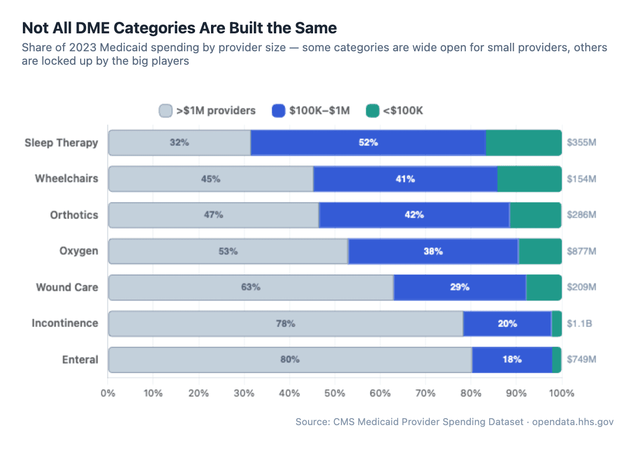
The industry isn't consolidating. The long tail is getting longer.
Provider Churn: 10–15% Turnover Every Year
Every year, a meaningful number of providers enter and exit Medicaid DME billing — but the rate varies dramatically by category.
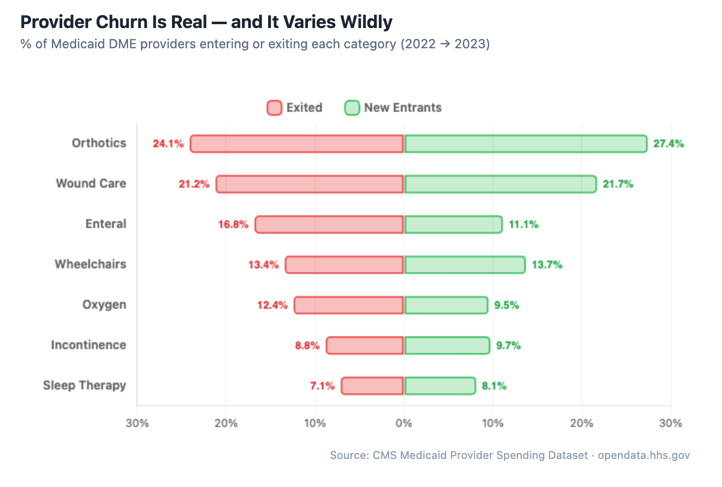
In orthotics, nearly a quarter of providers exit every year, with a slightly larger wave of new entrants replacing them. Wound care is similar — about 1 in 5 providers billing Medicaid in any given year won't be billing the next year. Meanwhile, sleep therapy is far more stable, with only about 7% exiting annually. This pattern held steady from 2019 through 2023.
An important caveat: this is Medicaid billing churn, not necessarily business churn. A provider disappearing from this dataset could mean they closed their doors, but it could also mean they stopped accepting Medicaid to focus on better-reimbursing Medicare or commercial payers, merged under a different NPI, or simply fell below the dataset's suppression threshold (rows with fewer than 12 claims are hidden). That second one — providers dropping Medicaid because reimbursement rates are lower — is probably a meaningful chunk of what we're seeing.
But for DME providers who are committed to serving Medicaid patients, the effect is the same either way: less competition for the providers who stay.
What's driving the turnover? The data can't tell us directly, but the pattern suggests a market with low barriers to entry and meaningful operational challenges that push providers out. Whether it's Medicaid reimbursement pressure, compliance burden, prior authorization complexity, or simply the difficulty of scaling a DME/HME operation, the churn is real and consistent.
For providers who stick around and figure out the operational side, this creates real opportunity. Every provider that exits — for whatever reason — leaves Medicaid patients who still need equipment.
Supplies Are the Growth Engine, Not the Core Equipment
One of the more actionable findings: across categories, consumable supplies are growing significantly faster than the core capital equipment.
In sleep therapy, CPAP devices (E0601) grew 50% from 2019 to 2023. Solid growth. But CPAP headgear (A7030) grew 111% and mask cushions (A7031) grew 154% over the same period. The recurring supply revenue is expanding more than twice as fast as the device sales.
Same pattern in wound care: NPWT pumps (E2402) have been essentially flat for five years at around $50M. Meanwhile, gradient compression stockings (A6530) grew from $2.6M to $11.6M — a 346% increase. Specialty dressings and skin substitutes are seeing similar acceleration.
The implication for DME and HME providers is straightforward. Supplies generate recurring revenue, have simpler fulfillment logistics, and are growing faster than the equipment they support. Providers who build their operations around supply fulfillment, resupply programs, and efficient claims management are positioned to capture more of the market's growth.
How We Did The Analysis
The raw dataset is a single 2.9GB compressed file (roughly 10GB uncompressed) with 227 million rows — not something you can open in a spreadsheet. We used Claude Code to do the heavy lifting. If you haven't heard of it: it's an AI-powered coding tool where you describe what you want in plain English, and it writes and runs the code for you.
We never wrote a line of code ourselves. We just had a conversation with it:
"Pull out all the sleep therapy, wound care, and wheelchair claims and show me the top providers by year." It wrote Python scripts to query the 227 million rows using DuckDB, a database engine that runs on your laptop with no server needed. It figured out which HCPCS codes map to which DME categories on its own.
"What other big DME categories are we missing?" It queried every HCPCS code above $5M in annual spending, grouped them, and surfaced 5 additional categories we hadn't thought to include.
"Enrich these with provider names." It called the CMS NPI Registry API hundreds of times to convert raw NPI numbers into actual provider names, addresses, and specialties. When it hit errors from null values in the data, it debugged and fixed them without us stepping in.
"Analyze the data for interesting trends." It ran 10 separate analyses — growth by provider size, churn rates, market concentration, procedure code trends, seasonality, cross-vertical providers — and built the entire interactive report with charts, year toggles, and collapsible tables.
It even launched parallel research agents to search the web for regulatory context, like why CGM spending suddenly dropped (turns out there was a coding reclassification).
The whole thing took a few hours of back-and-forth conversation. What would normally require a data engineer and a few days of work was done in an afternoon.
Explore the Data Yourself
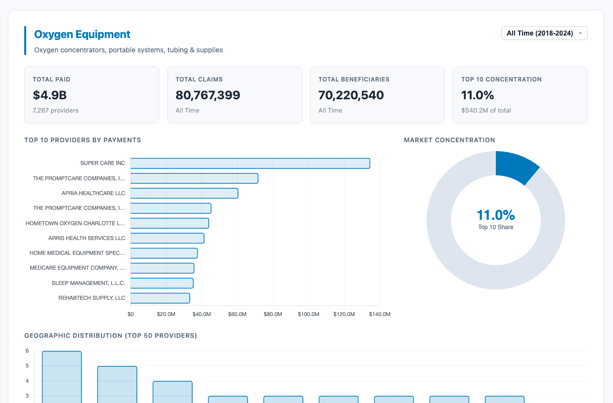
We built a free, interactive tool that lets you explore all of this data across 8 DME categories, filter by year (2018–2024), see the top 50 providers in each vertical, and examine market concentration and geographic distribution.
Explore the Medicaid DME Provider Spending Analysis:
https://research.docflowlabs.com/hhs-dme-data/
The underlying data comes from the CMS Medicaid Provider Spending Dataset on the HHS Open Data portal.
Have a specific question about the data? Want to see a particular category, state, or provider breakdown we haven't covered? Reach out — we're happy to pull custom cuts of the data for anyone in the industry. Just drop us a line at info@docflowlabs.com.